Driving Revenue Through Digital Aftercare
Mental Health Outcomes (MHO) faced shrinking patient responsiveness to aftercare that impacted their business model. They needed to transition from telephone-based aftercare to digital engagement. Their solution was Reflections, a mental health companion app for post-discharge patients.
Business Objectives
Drive revenue by reducing patient drop-off from UHS facilities through post-discharge aftercare
Enhance patient engagement and outcomes through self-monitoring and self-care tools
Enable flexible data capture to improve UHS relationships with payors

Impact
The app launched as a branded pilot, gathering a cohort of around 100 patients who downloaded and initiated accounts.

Design Philosophy
Respecting the patient's mental state guided every design decision. The app's architecture and interactions balance encouragement with autonomy, avoiding pressure while promoting engagement.
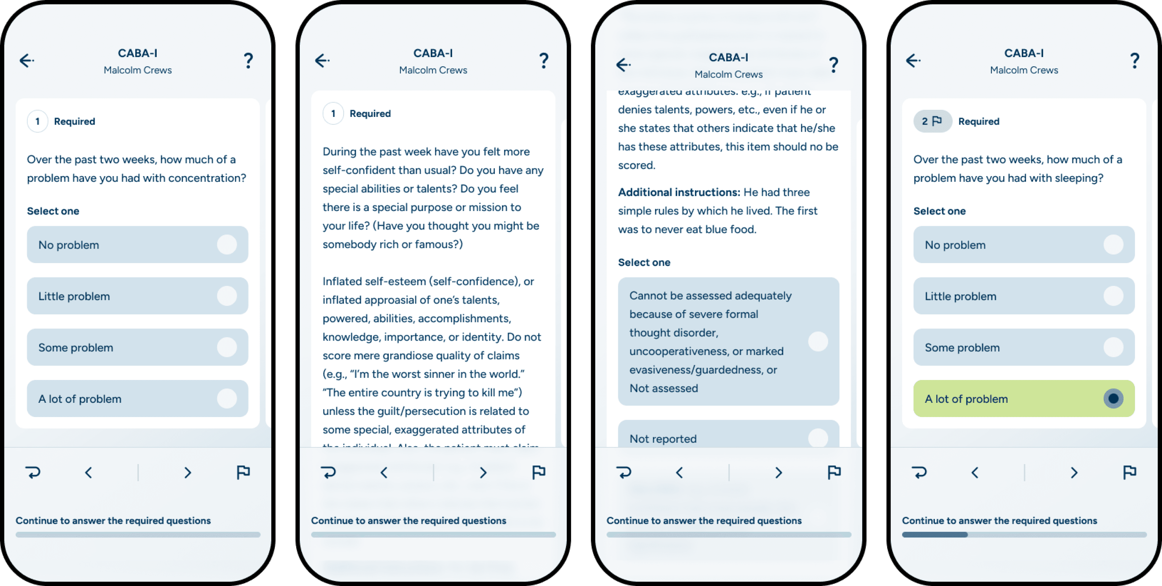
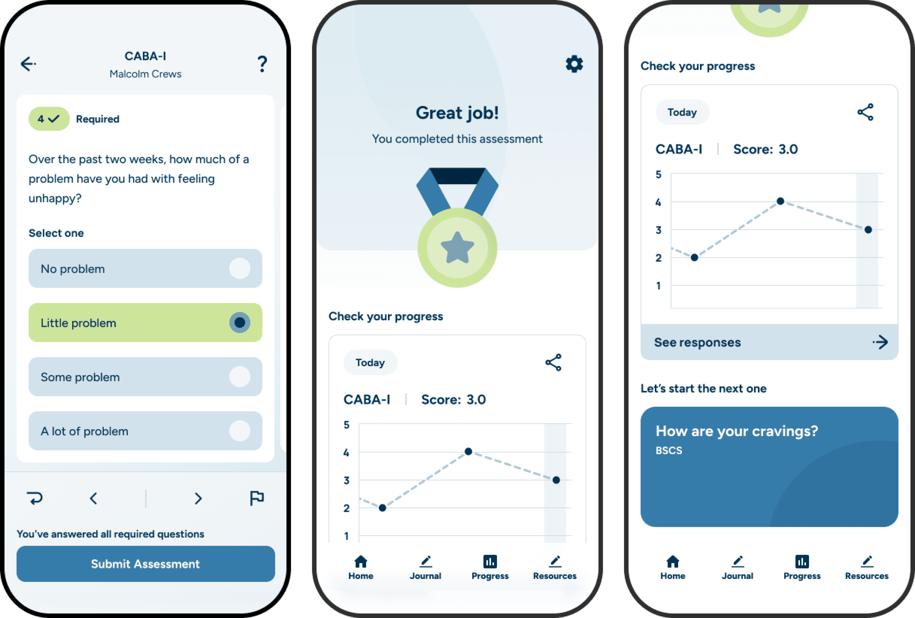
Color psychology played an essential role. I used the brand's blue monochromatically to evoke calmness throughout the app. The brand's neon green was conservatively applied to signal progress, making each occurrence feel special and energizing.
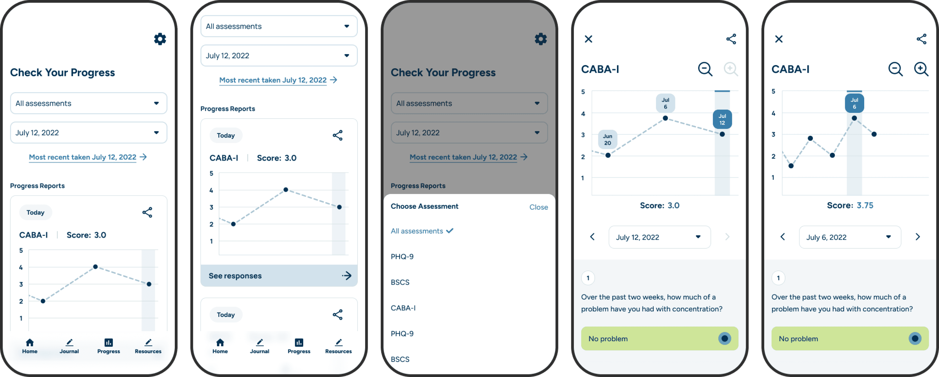
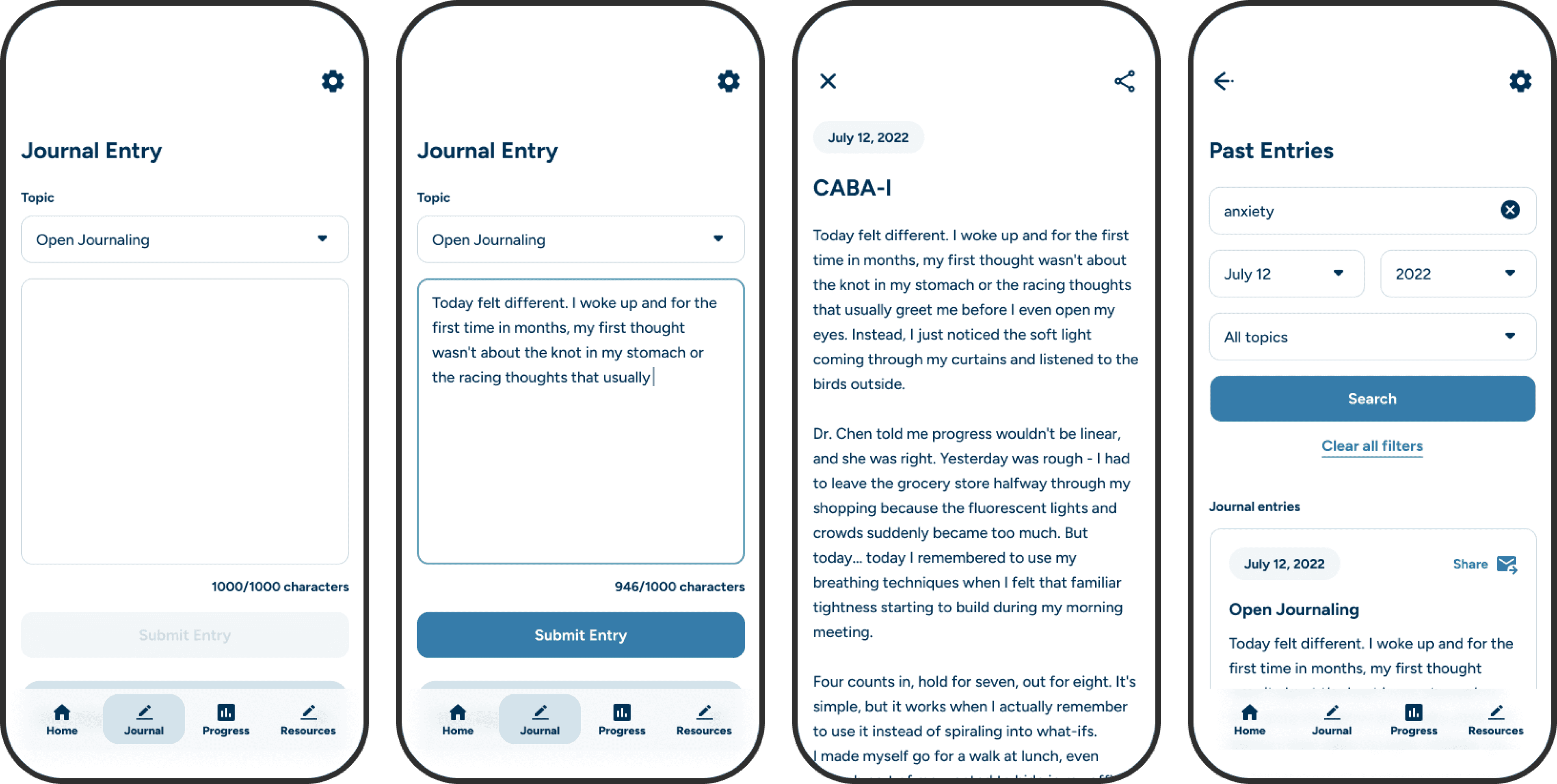
Core features included clinical assessments synchronized with the provider's web portal, progress tracking by assessment, daily mood check-ins, and journaling.
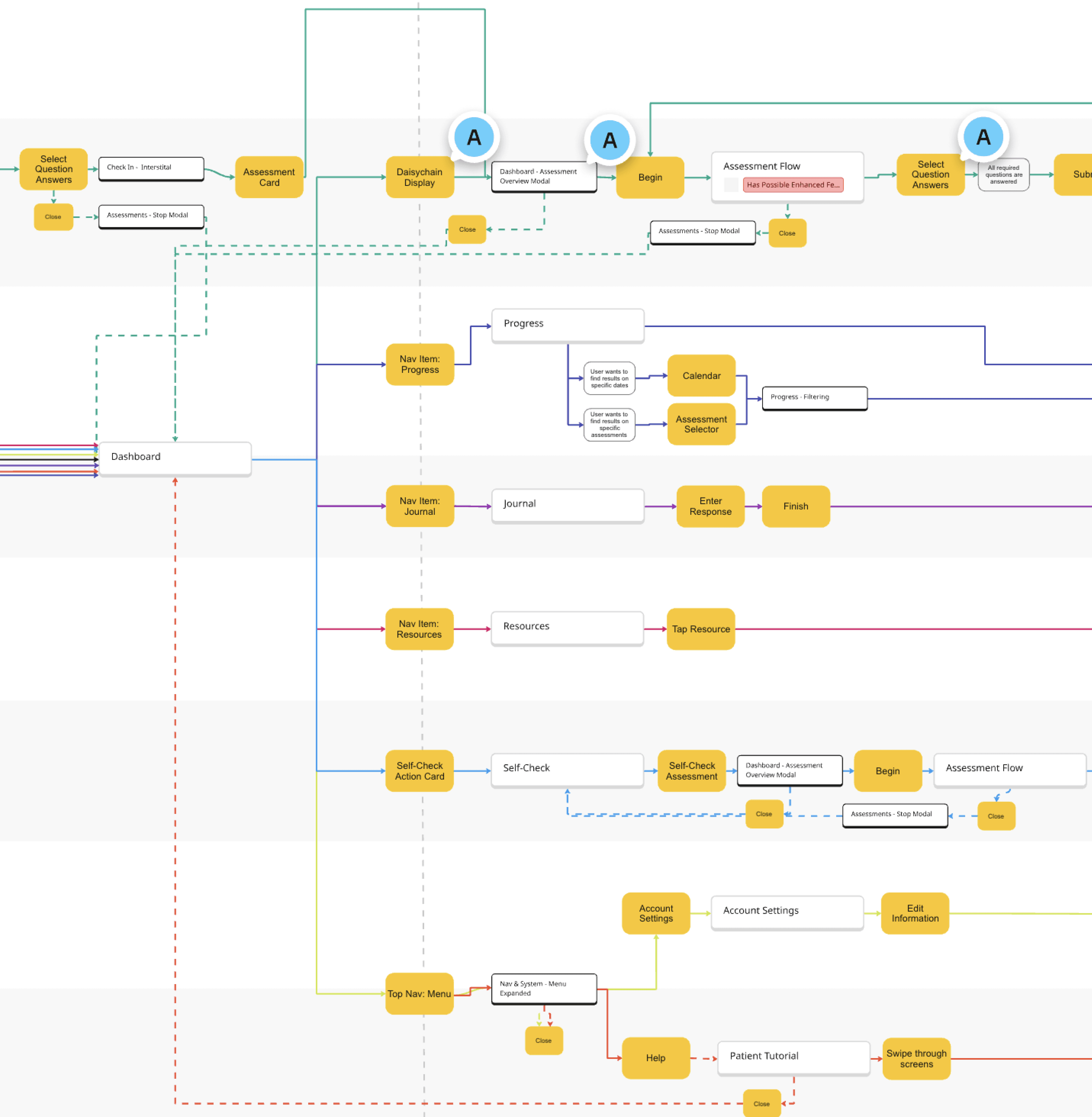

Empowering Assessment Taking
Clinical assessments were the app's core feature. Patients needed to complete multiple assessments, some containing substantial questions of significant length. We couldn't alter the clinical content. The challenge was keeping users from feeling lost or overwhelmed.
Our solution was the "Daisychain" structure. We displayed today's assigned assessments as a connected list on the homepage. This set workload expectations and communicated holistic progress with each completion. Users had freedom and control—they knew what to expect and could visualize their efforts.
Key design decisions:
Patients control the order and timing of assessment completion
Entry and exit require little effort while ensuring intentional opt-in
Assessments are siloed experiences to maintain focus and avoid pressure
Vertical scrolling progresses individual questions; horizontal swiping moves through the question list. This differentiation makes navigation seamless
Dedicated interactions allow flagging and returning to skipped questions
This interaction system gave users total control over how they completed assessments, reducing friction and increasing completion rates.

Encouraging Continued Engagement
After completing an assessment, patients should feel accomplished but also motivated to continue. Interstitial screens balanced achievement with encouragement.
After submission, screens visually rewarded the patient, displayed their earned score for reflection, and offered a touchpoint to begin another assessment—all while preserving careful opt-in decision-making. This drove patients toward completing remaining assessments rather than ending their session, improving data collection without feeling coercive.
Progress tracking visible to the user also played a key role in engagement. It enabled patients to see the same information as their doctor and recognize their journey. In combination with self-led journaling, the user had an assortment of tools available that would reduce drop-off from UHS facilities.
Austin Wallace Greene © 2026