32% User Growth and 60% App Activation in Six Months
Sharp HealthCare underwent a 10-year system migration to the Epic EHR platform. They needed a mobile experience that extended the Sharp brand and made transactions seamless.
Business Objectives
Grow by establishing Sharp as the most consumer-friendly health system in San Diego, California
Increase patient engagement and provide seamless access to health records

Impact
32% user base increase from 262,000 to 347,000 users within six months post-launch
60% app activation rate among all patients with clinical encounters
Research Foundation
Comprehensive user research was done to understand patient needs, leveraging Sharp's pre-built consumer insights group.
Research activities:
Bi-weekly consumer and patient interviews
Testing key MyChart features with Epic feedback loop
Monthly consumer insight group meetings
67 patient interviews (in-home and facility)
Survey data analysis
Interviews with other health systems
Industry and out-of-industry competitive review
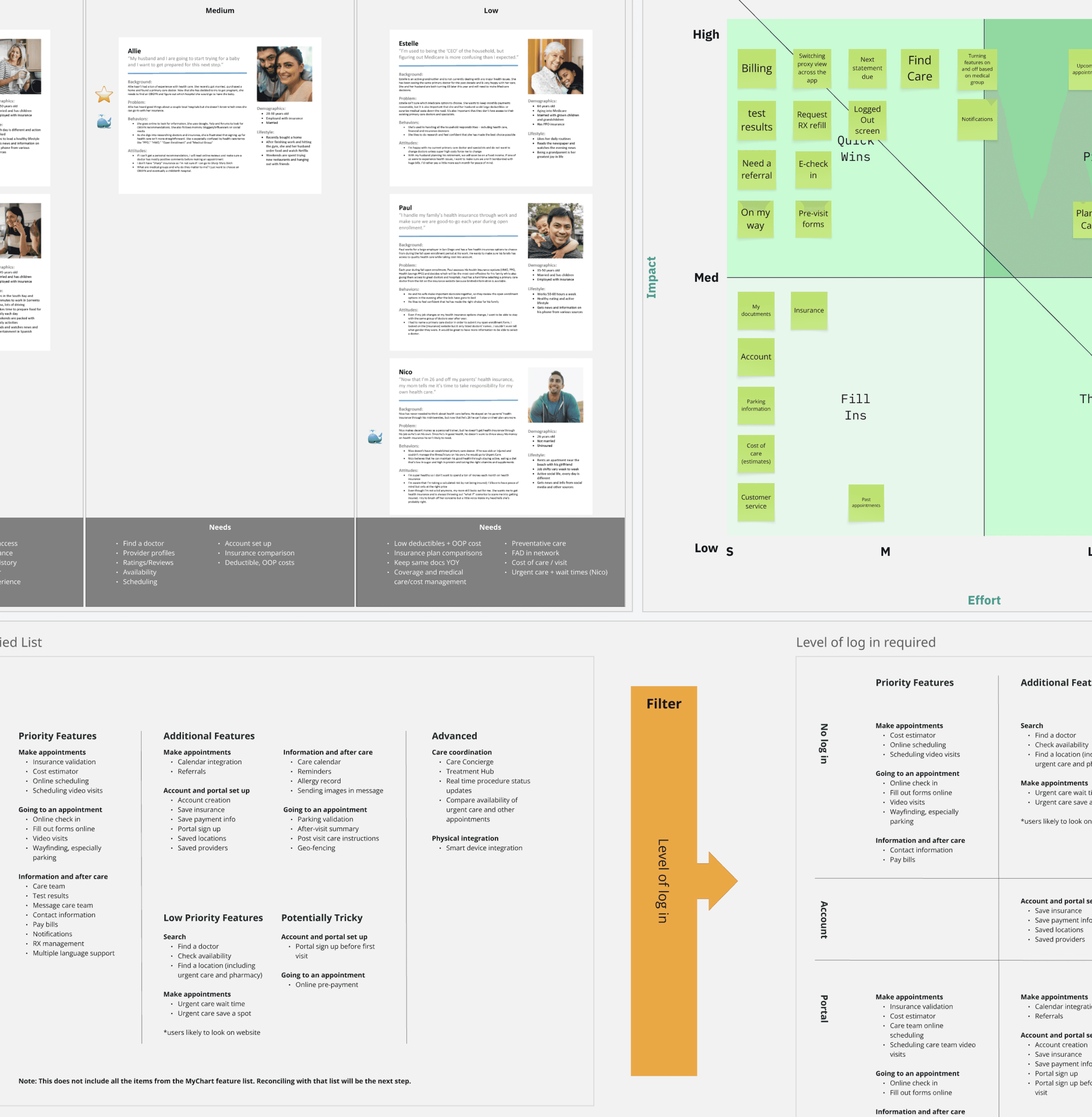
Key Findings
After quality of care, patients were leaving Sharp due to communication and accessibility issues: lack of response when scheduling, limited availability, and inconvenient booking methods.
Patients sought four key qualities:
Convenience
Information transparency
Better access to the right care
Compassion
Our critical user journeys were making primary care appointments for themselves or their children, beginning specialty care, and managing multiple care streams.
Based on these needs, I helped plan a hybrid app model integrating Epic features with custom development. We used custom development for high-value features that addressed customer attrition where out-of-the-box Epic would leave us disadvantaged. This optimized cost and time to market.
Art Direction
Sharp needed a clean, branded design that felt comfortable while meeting accessibility standards.
I audited visual approaches that matched Sharp's desired direction, identifying which design decisions created the right look and feel. With Sharp's senior designer, I explored style variations using high-value screens. This gave us enough elements to experiment with and concepts to present to leadership for buy-in.
We landed on a rounded, friendly approach that moved Sharp's visual language forward.
Seamless Access to Objectives
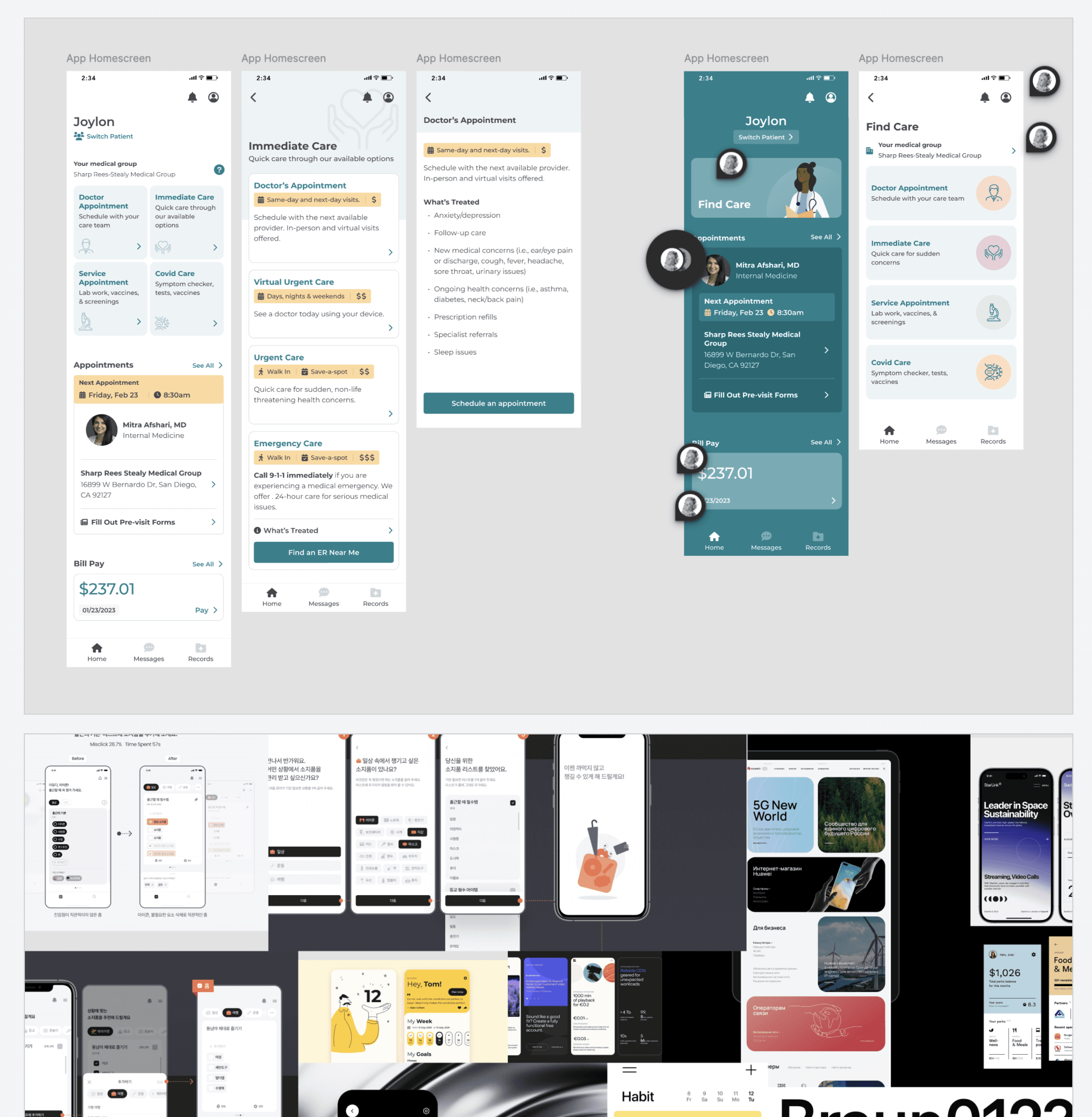
Once logged in, users needed the most convenient access to complete their objectives. The home screen served as the central action hub with single-tap access to all care services.
Rather than grouping actions into parent landing pages (like a single "get care" button leading to a list), I faceted content into distinct, intuitive categories. This gave users the shortest pathway to their goals.
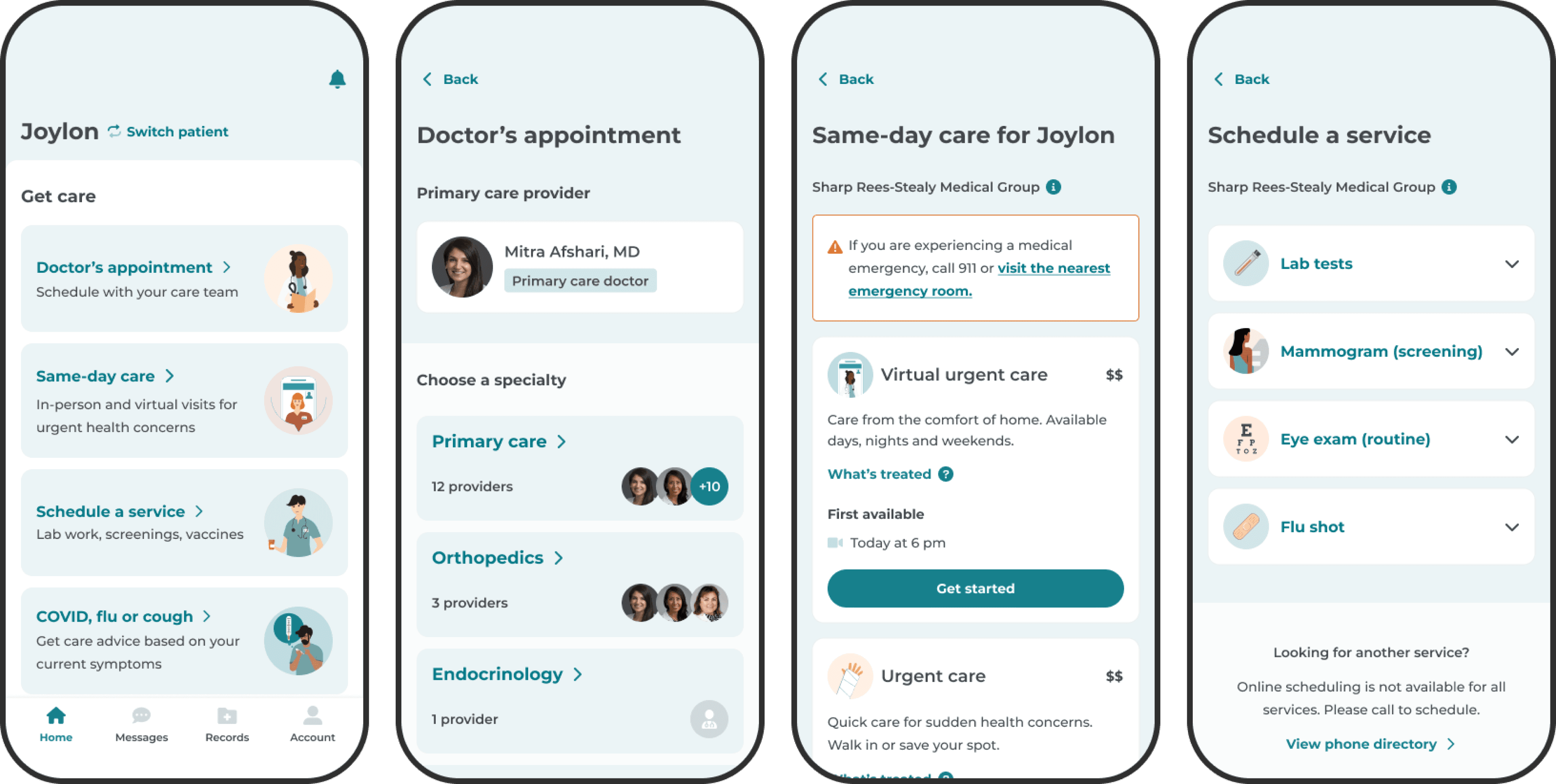
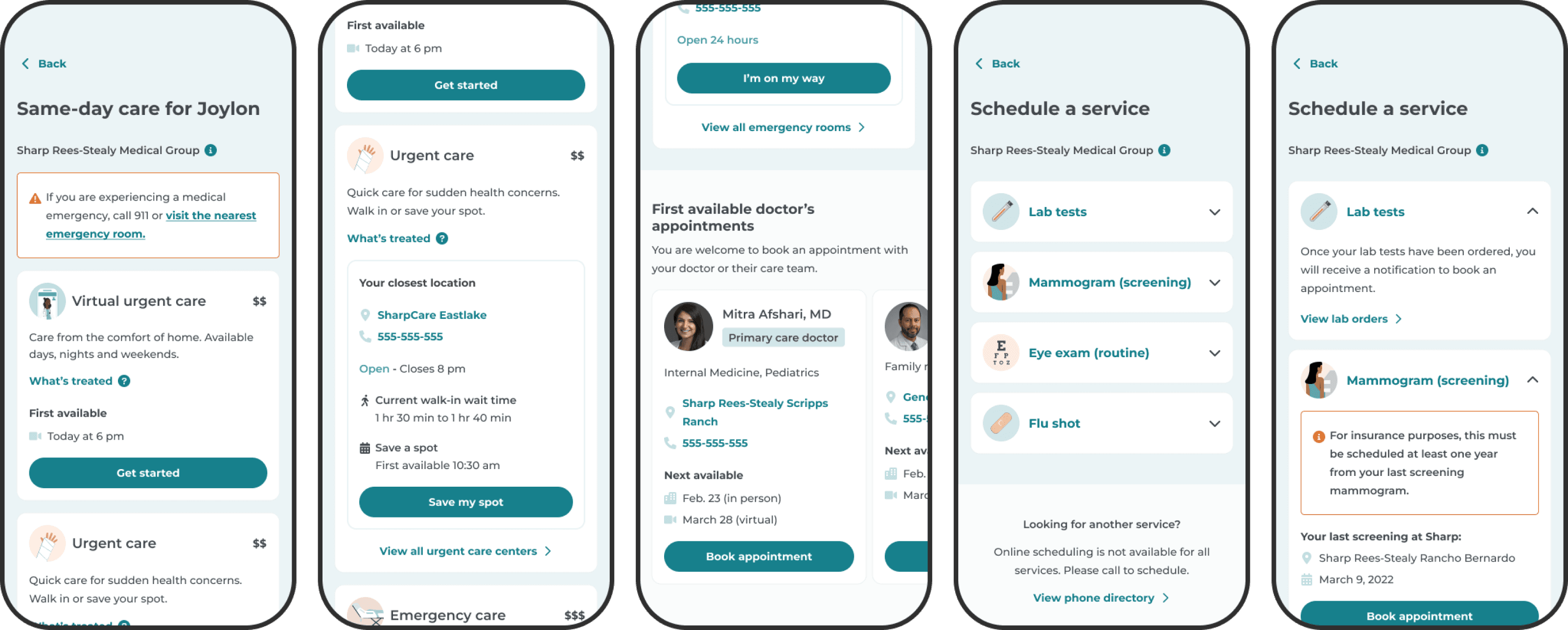
Personalized Booking
Healthcare mobile apps are primarily used by existing patients. I designed online scheduling for personalization.
When making appointments, users first saw doctors and specialties they'd already established as their care team. The app then showed only in-network doctors connected to their care team or patient medical group affiliations. For finding new doctors, the app opened Sharp.com in a browser view.

Compassionate Foundation
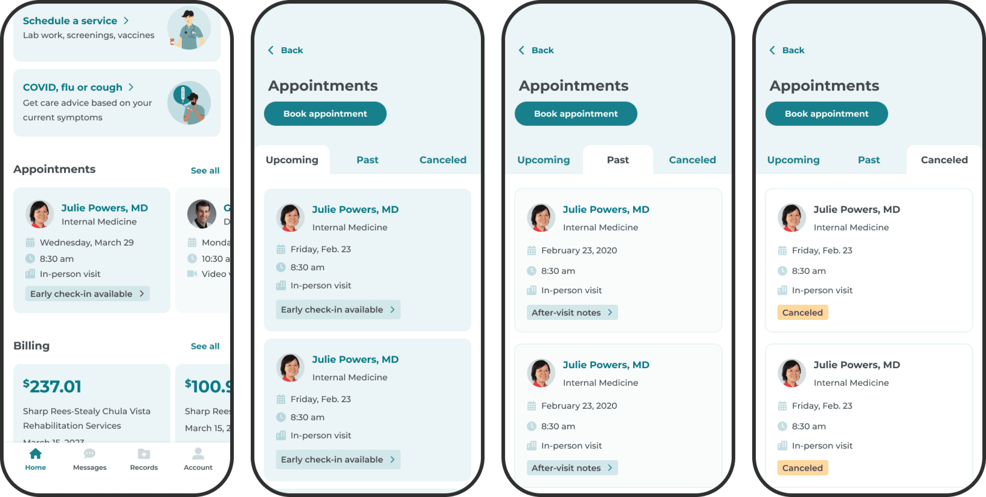
To enable provider-patient relationship building, I included features for messaging care teams and centralized appointment oversight. Messaging was a core navigation option. Patients could access upcoming, past, and canceled appointments from the home screen.
Austin Wallace Greene © 2026